
We write a lot of reports at Bishop Fox (it’s what happens when you hack all the things). This frequently results in needing to redact certain text. We have a long-standing policy that when you redact text, the only way to do it securely is to use black bars. Sometimes, people like to be clever and try some other redaction techniques like blurring, swirling, or pixelation. But this is a mistake.
Today, we’re focusing on one such technique – pixelation – and will show you why it’s a no-good, bad, insecure, surefire way to get your sensitive data leaked. To show you why, I wrote a tool called Unredacter that takes redacted pixelized text and reverses it back into its unredacted form. There’s plenty of real-world examples of this in the wild to redact sensitive information, but I won’t name names here. Watch my video for a quick recap of the importance of NEVER using pixelation to redact text, as well as how I unredact Jumpseclabs's Challenge in real-time.
Challenge Accepted
So there’s an existing tool called Depix that tries to do exactly this through a really clever process of looking up what permutations of pixels could have resulted in certain pixelated blocks, given a De Bruijn sequence of the correct font. I like the theory of this tool a lot, but a researcher at Jumpsec pointed out that perhaps it doesn’t work as well in practice as you’d like. In real-world examples you’re likely to get minor variations and noise that throws a wrench into the gears. They then issued a challenge to anyone, offering a prize if you could un-redact the following image:
How could I refuse such a challenge?!
How Pixelation Works
Pixelation looks like this:
The algorithm is pretty simple; you divide up your image into a grid of a given block size (the example above is 8x8). Then for each block, you set the redacted image’s color equal to the average color of the original for that same area. That’s it – just a rolling pixel average for each block.
The effect sort of “smears” the information of the image out across each block. But while some information is lost in the process, it absolutely leaks plenty through. And it’s this leaked information that we’ll be using to our advantage.
Notably, this algorithm is widely standardized since it’s so simple. So, no matter whether you do this redacting in GiMP, Photoshop, or basically any other tool, the redaction will turn out the same.
For our proof-of-concept, let’s assume that the attacker knows:
- The font type of the redacted text
- The font size of the redacted text
- That the redaction is of text to begin with
These are fairly reasonable assumptions, I would assert, since the attacker in a realistic scenario would likely have received a full report, with just one piece redacted out. In our challenge text, you can see a few words right above the pixelated text that give us this information.
The Many Problems to Beating the Redaction
The key thing we’re focusing on is that the redaction process is inherently local. In cryptographic terms, we’d say it has no diffusion. A change of one pixel somewhere in the original image ONLY impacts the redacted block it belongs to, meaning that we can (mostly) guess the image character by character. We’ll do a recursive depth-first search on each character, scoring each guess by how well it marginally matches up to the redacted text.
Basically, we guess the letter “a”, pixelate that letter, and see how well it matches up to our redacted image. Then we guess the letter “b”, and so on. Doesn’t sound so hard, right? Well, there’s still a bunch of logistical issues to overcome that might not be so obvious at first! Let’s dig into those further.
The Character Bleed-Over Problem
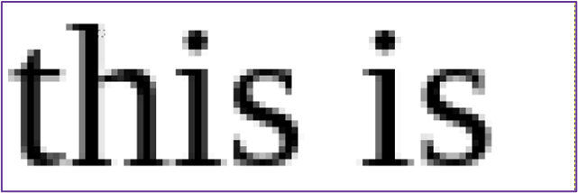
The first problem we immediately encountered is that the characters of our text don’t line up 1:1 with the blocks of the redaction. This means that a given correct guess might actually have some wrong blocks on the right-most edge. To see what I mean, check out this example:
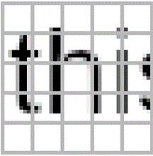
You can see that the letters “t” and “h” share a column of blocks. So, if we try to make a guess for the letter “t”, the left-most column of blocks turns out correct, but the right-most ones are a bit wrong.
Correct Pixels vs. Guess for “t” vs. Difference
The reason the second column is wrong is because the letter “h” is there messing things up. If we just looked at this alone, you might conclude that the letter “t” was an incorrect first letter, since it gets almost half of the blocks totally wrong.
The first thing we tried was to avoid counting the right-most block of any guess. It’s the column that will have the most bleed-over and can have quite a bit of error. The problem with this was that, in practice, it reduced the total size of our guess by so much that you start receiving false positives. There’s always a chance that your letter will accidentally line up and produce a match by pure chance, and this chance goes way up when there’s fewer blocks to consider.
So instead, what we did was to chop off the comparison block at the boundary of the letter itself. Thus, our diff would look like this:
You can see the quality of our match went way up, since we’re including less of that incorrect area on the right. This is because we chop the comparison off at the edge of where the “t” ends:
The benefit to doing it this way is that the more our guess character extends into the block, the more likely the block is to be a good guess, and so we keep more of the block. So, it will automatically chop off most of the block when the guess is bad and keep most of the block when it’s good.
The Whitespace Problem
A specific subset of the character bleed-over problem is that whitespace tends to break a few of our assumptions on how character guessing works. Inherent to this whole problem is the assumption that when we guess a correct character, we expect the resulting pixelated version of it to mostly resemble the challenge image.
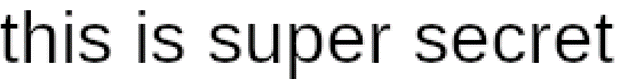
However, this isn’t always true when the character we guess is whitespace. When that happens, the pixelated blocks will be completely overtaken by the next character. Take this example, making the guess “this is ” (with a trailing space):
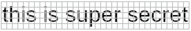
This is then pixelated like below, with a trailing blank column as you’d expect:
The problem is that in the solution image, there is another character after the space. It bleeds over so badly that our correct guess looks to be completely wrong!
There’s more than one way to tackle this problem. The most obvious is to never make whitespace guesses on its own, and instead pair it up with some other non-whitespace character. That way we can control the character that bleeds over. While this “works”, it effectively doubles the available character set. This slows the whole process down to a crawl.
Instead, what we can do is make a special carveout for whitespace guesses that give them more leniency in what is considered a “good” guess. In testing, it seemed that the bleed-over is never so bad that it’s beyond a lower threshold. It’s a bit kludge-y, I’ll grant you, but it seems to work.
The Variable-Width Font Problem
Most fonts that people write with are variable width. This means that the amount of horizontal space that each letter takes depends on the letter itself. For instance, a “w” takes up more space than an “i”. This is in contrast to monospace fonts, which deliberately space letters such that each one takes up the same amount of horizontal space.
Variable Width:
iiiii
wwwww
Monospace:
iiiii wwwww
What this means for our attack (which is assumed to be in a variable-width font) is that each guessed letter has a cascading effect to the right of it. If you make the guess:
this is supww
Then all future letters will be off, even if the letters are otherwise “correct”.
This sounds like a big deal, but it’s actually not so bad. It just means that we have to stick with a recursive depth-first search and not treat letters like individual and independent artifacts. Recursive depth-first search works well here because it naturally takes that ordering into account. It works the following way:
Suppose we have the current guess of:
this is su
What we do is try out each character for the next letter and see which ones match up reasonably well with the redacted image. We’ll wind up with some subset of “good” guesses, perhaps “p” and “q” since p is correct and q resembles it pretty closely. We’ll then begin this whole process of guessing again for the new string of “this is sup” down the chain until we hit a dead end with no good guesses. At which point, the function call stack will naturally back up to try our other guess q.
And so on, until we’ve exhausted every “good” guess there is.
The Font Inconsistency Problem
As it happens, different rendering engines produce slightly different images even for what should be the exact same font. Look at these two captures of the same text. On top is GiMP’s rendering in Sans Serif and on bottom is FireFox:
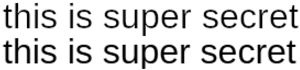
They’re almost identical, but not quite. There are two things that stand out; one is the length. You can see that the top image is just a LITTLE longer. For long enough strings, this can have a cascading effect that will throw the whole thing off. The other difference is how the text is rasterized; the bottom line is just a little bit bolder than the top one. This one we can mostly handle by adjusting for brightness, but it’s a total pain.
For Unredacter, we’re using Electron to take screenshots of a local headless HTML window. So, the renderer will essentially be Chrome. Most of the time, this is not a problem. But if your redacted text was rendered using some really wonky program that doesn’t adhere to standards, then it might wind up veering off course quite a bit. Keep that in mind.
If someone out there wants to write a wrapper for Unredacter that generates guesses using MS Word through some Rube Goldberg machine of wrappers and macros, you’re welcome to give it a go.
The Pixelation Offset Problem
When pixelating an image, there’s two degrees of freedom that have to be accounted for: the x and y offset coordinates. But what the heck are those?
Consider the image of our guess text separated out into 8x8 blocks:

If you think of this as a static grid, then there’s 64 distinct locations for you to place the text on that grid. We call this the x and y “offset”. Depending on the offset you choose, it can produce dramatically different images:
Different Offset Values for Same Text
Furthermore, there’s no way for the attacker to know what these offsets were. (Unlike the font and font-size). The offset is determined in most editors like GiMP by the mostly random process of where the user happened to have clicked when making a bounding box. If they had clicked a single pixel up or down, the pixelation would have made a fairly different image!
The good news here is that there’s not THAT many possibilities for offsets. There’s blocksize2 permutations. For a block size of 8, that makes 64 offsets to try. In our challenge text, the block size is 5, meaning there’s only 25 offsets to test.
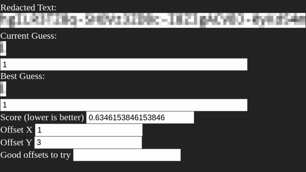
So, step one of Unredacter is to discover what offset was used. We do this by trying each offset in a loop and see if ANY letter comes up with a good first-letter guess. We take all the offsets that have good first-letter guesses and add them to a list to then try proper guesses.
Solving the Jumpsec Challenge Text
Okay! Armed with this knowledge, and a tool to exploit it, let’s take a look at Jumpsec’s challenge image again:

One of the first things you might notice is that it has a curious bit of coloring in it. What gives? Shouldn’t it just be black and white since the text is black? Are they trolling us with colored letters?
I’m actually not 100% sure why this happens (and sometimes doesn’t), but it’s an artifact of the rasterization process when text is rendered to screen. Just look at what happens when you zoom in to text typed out in Notepad:

When Unredacter renders the letters to a headless Chrome window, no colorized artifacts appear, so we’ll need to convert the image to greyscale. This will lose some information, but it’s fine. Unredacter doesn’t need exact matches, just for guesses to be “mostly right”. Once converted down, our challenge image looks like this:

There’s one last adjustment I had to make, and it’s on the bottom row:
It’s too small! The rest of the blocks are 5x5, but that bottom row is 5x3. After a few hours of trial and error, I also noticed that these blocks are too dark. Check out what a guess of the letter “g” looks like, versus the challenge image:
Challenge Image vs. Guess

See how that bottom row is way too dark? It’s because when the image was pixelated, they must have selected a bounding box that wasn’t a size with multiple of 5. So, when the algorithm determined the average, it was an average over a smaller area. (Thus darker) No matter, we can fix it up by just lightening that last row. This gives us our final challenge image of:

Next up is to figure out the correct font and font size. Luckily this wasn’t too hard, the image was taken in MS Notepad with the default font of Consolas. After a bit of trial and error, I found that the font size is 24px. (I did this by just trying font sizes over and over until the height of capital M matched up.) The only tricky part of this wound up being that Notepad apparently has a default letter-spacing of -0.2px. If you try rendering text in Chrome in Consolas, it’s much too long. But -0.2px letter-spacing matches up exactly.
Top: Original Challenge Image Bottom: Unredacter’s Headless Chrome Rendering
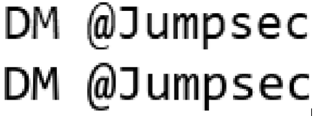
If you look closely, the “s”, “e”, and “c” has a little more of a curve in Notepad’s rendering. But it’s fine. Again, we don’t need to be 100% exact. This pretty close!
Unredacter pretty quickly homes in on an offset of [3, 1], so let’s see how it does!
After running for a few minutes, Unredacter spits out the final guess of:
You can even see with the naked eye that our guess is pretty close!
Top: Original Challenge Image (greyscaled & bottom row fixed) Bottom: Unredacter’s Guess
So I reached out to Caleb Herbert at Jumpsec, and they confirmed that my guess was correct!
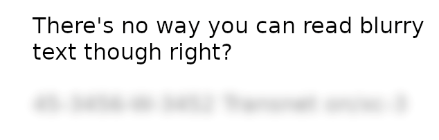
Caleb also asked me to not disclose the solution, so you reading this can have a go at it yourself. (It’s blurred out above, and there’s no way you can read blurred text, right?) Huge shoutout to Jumpsec for issuing this challenge, it was a lot of fun. Was a great way to test out a new tool, too!
We Challenge You
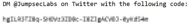
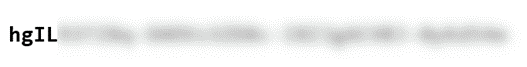
We accepted JumpSec's challenge and were inspired to host a similar challenge of our own (with a Bishop Fox twist, of course). We challenge you to decode the below blurred message and submit your entry to win a $50 Amazon gift card and exclusive Bishop Fox SWAG (awarded to first 5 correct submissions). All correct submissions will be automatically entered into our Grand Prize raffle drawing to win $500 Visa gift card. The Challenge is valid from March 31, 2022 at 8 a.m. ET through August 14, 2022 at 11:59 a.m. ET. One valid entry per entrant permitted.
For full legal rules, please visit: Contest Rules.
The Bottom Line
If you want to check out the proof-of-concept source code to Unredacter, it’s available on our GitHub right here.
The bottom line is that when you need to redact text, use black bars covering the whole text. Never use anything else. No pixelization, no blurring, no fuzzing, no swirling. Oh, and be sure to actually edit the text as an image. Don’t make the mistake of changing your Word document so that it has black background with black text. (You can still read that just by highlighting it like this.)
The last thing you need after making a great technical document is to accidentally leak sensitive information because of an insecure redaction technique.

Subscribe to our blog
Be first to learn about latest tools, advisories, and findings.
Thank You! You have been subscribed.
Recommended Posts
You might be interested in these related posts.